Brand | Print
Skin Deep
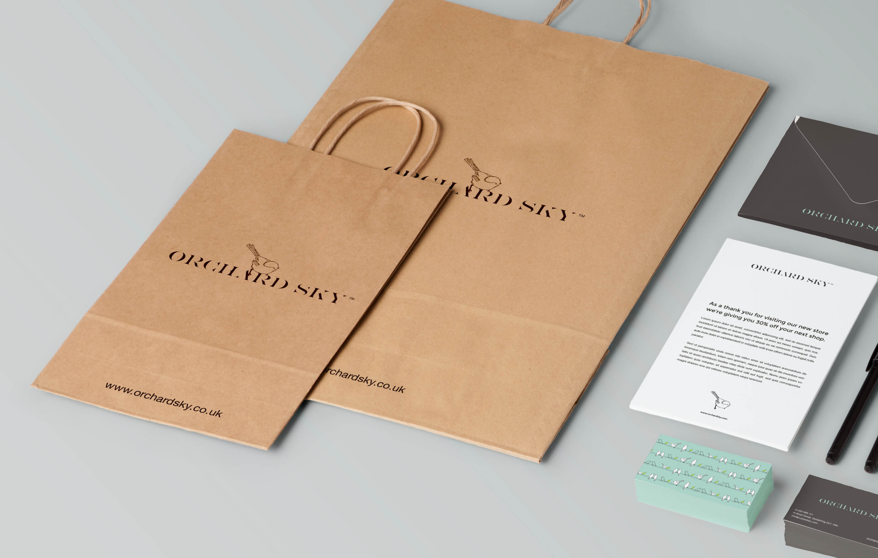
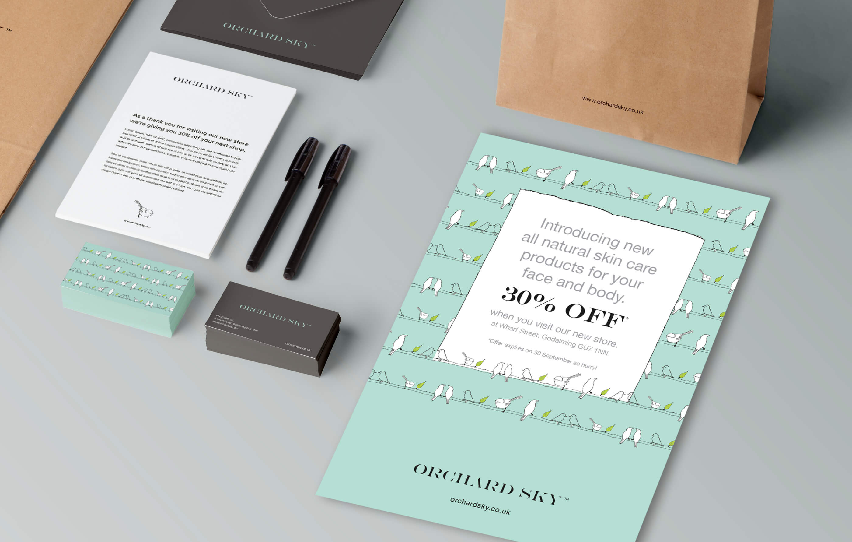
Orchard Sky is a new female skincare company. With plans to open their first store, the cosmetics brand wanted to
create a visual identity that was different from other competitors in a highly saturated marketplace.
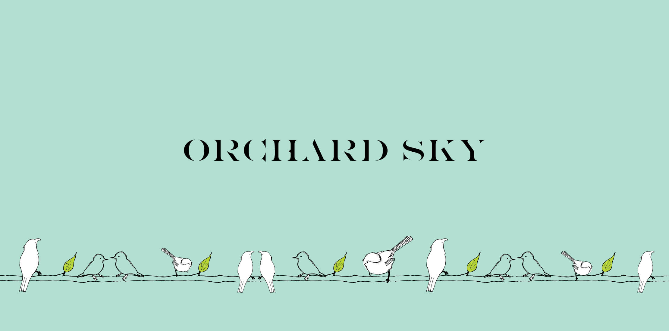
After highlighting the company’s key brand values and future goals, we developed a style that blended illustration and vibrant, fresh colours. This gave us a great design platform from which we created the logo, colour palette, stationery, packaging and advertising.
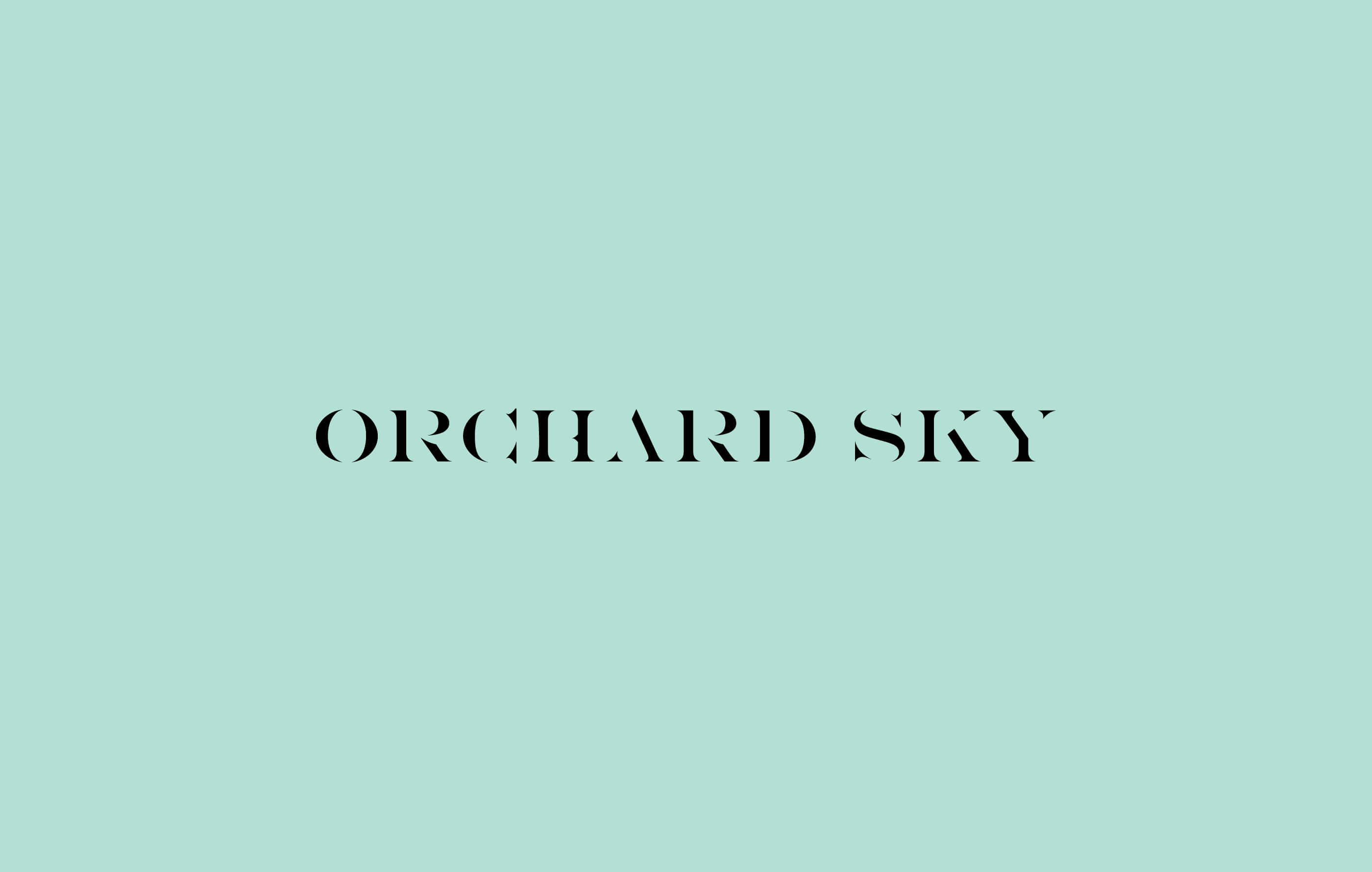
Orchard Sky was born.
-
Services
Logo & identity design
Brand positioning
Illustration -
Client
Orchard Sky