Brand | Print
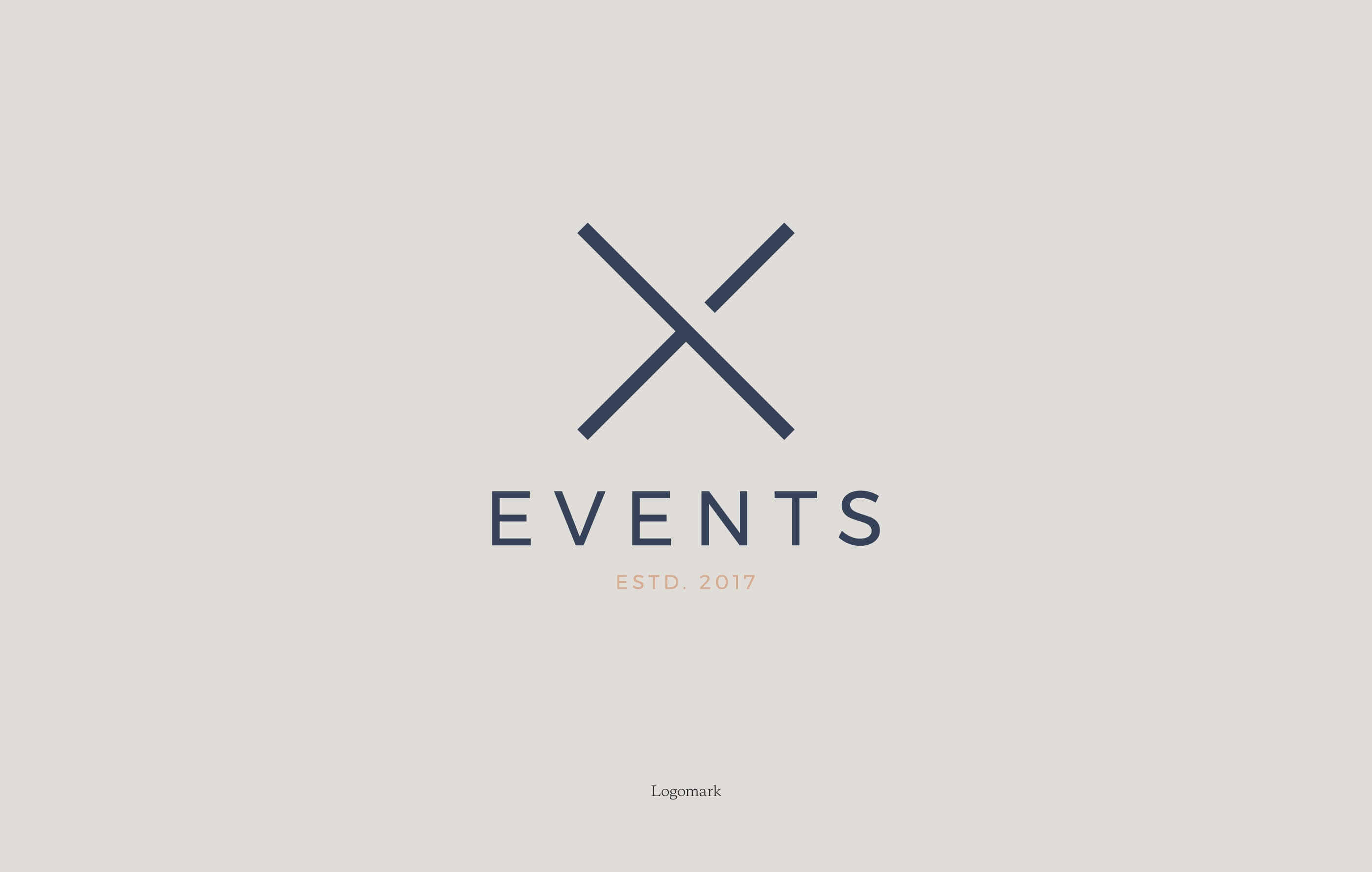
X
X Events is a fresh-thinking creative agency who work with corporate brands to deliver unforgettable events,
once-in-a-lifetime experiences and motivational sales incentive programs.
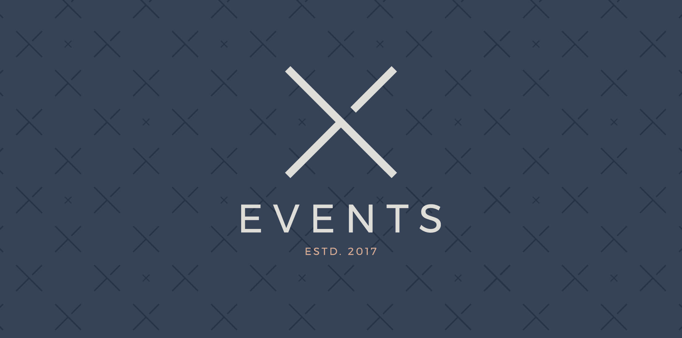
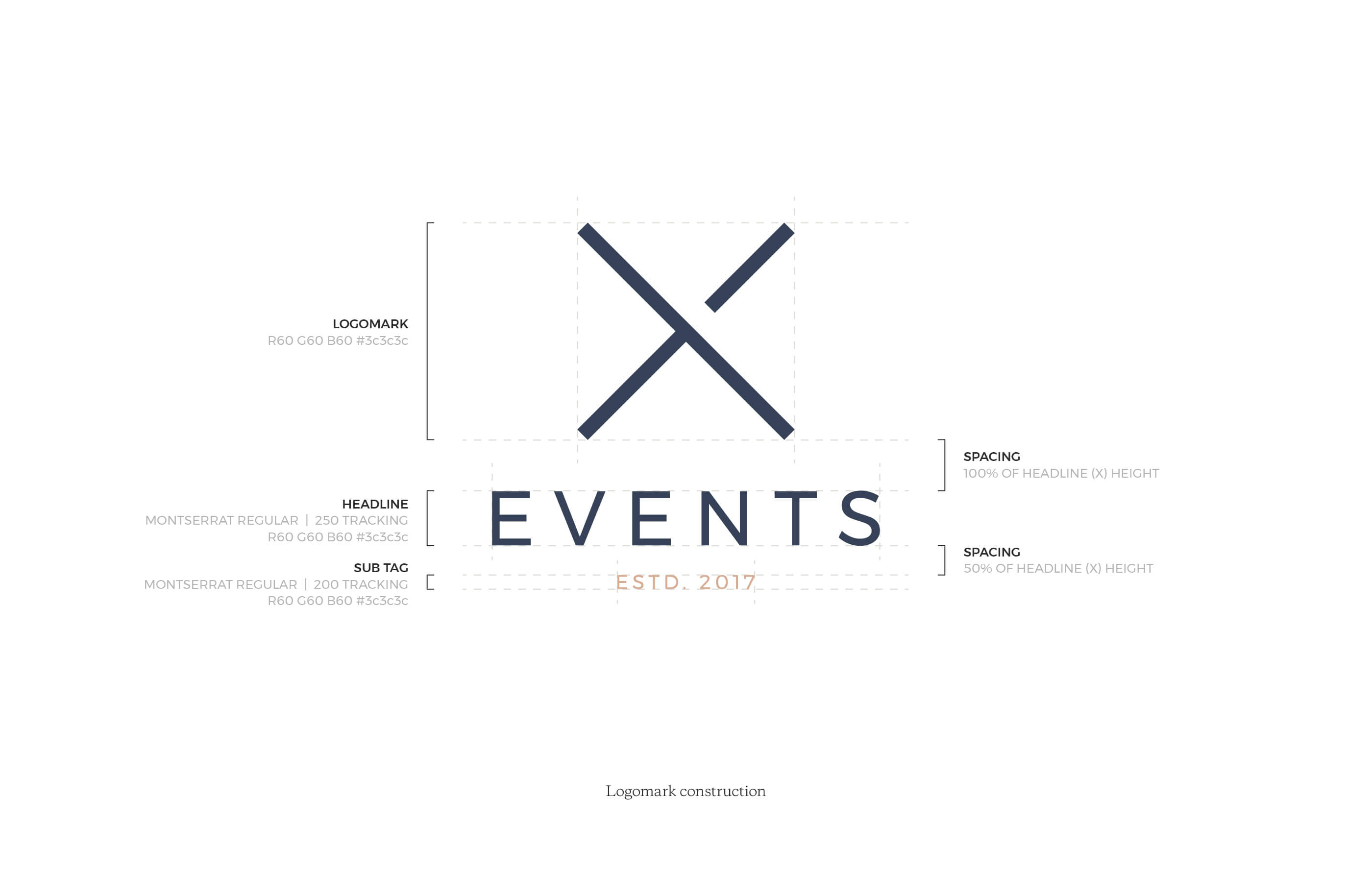
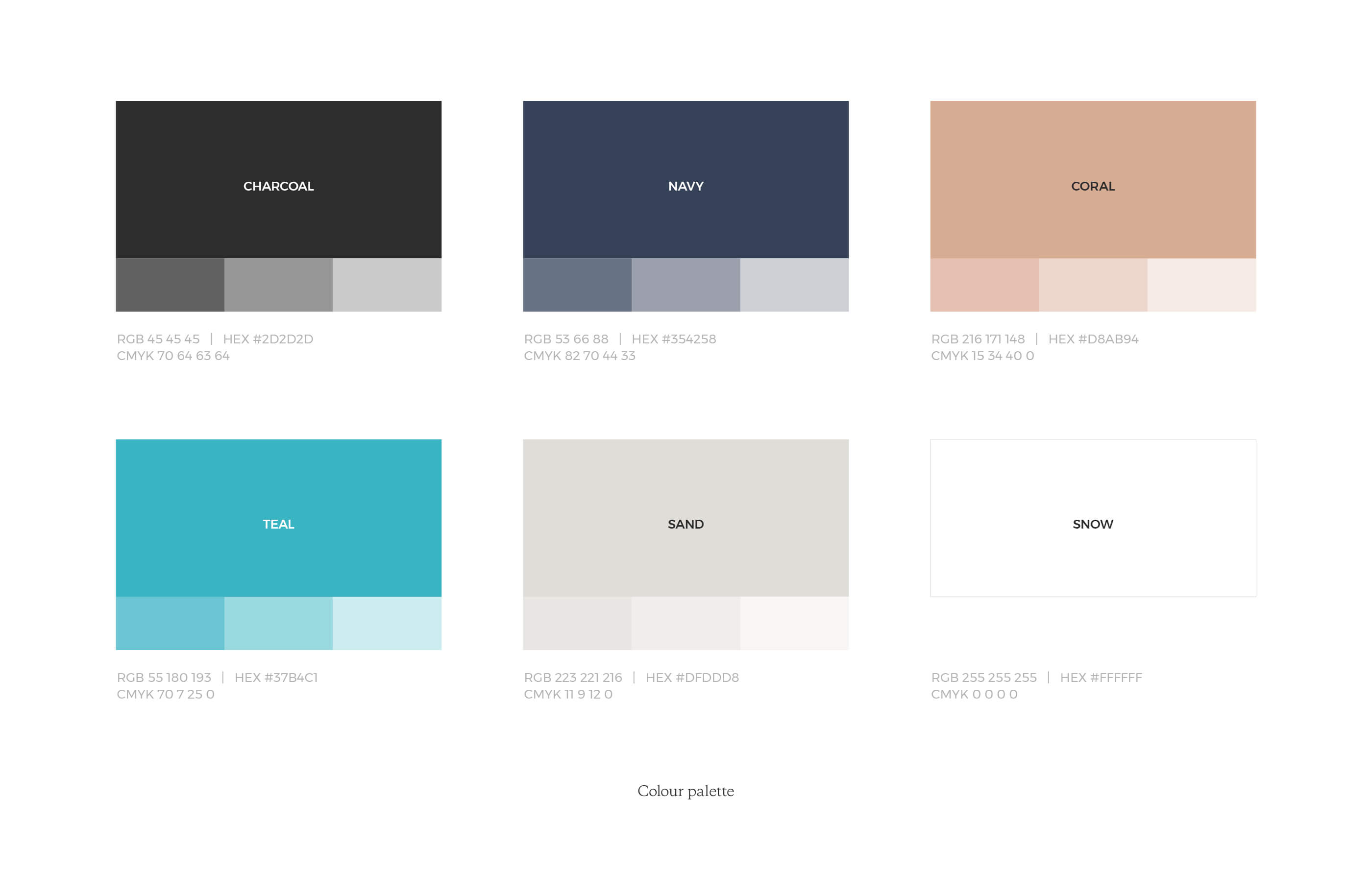
They wanted an understated identity that was clean and contemporary, to suit the corporate market, and as a start up headed by women, were keen to adopt a colour palette with a feminine touch.
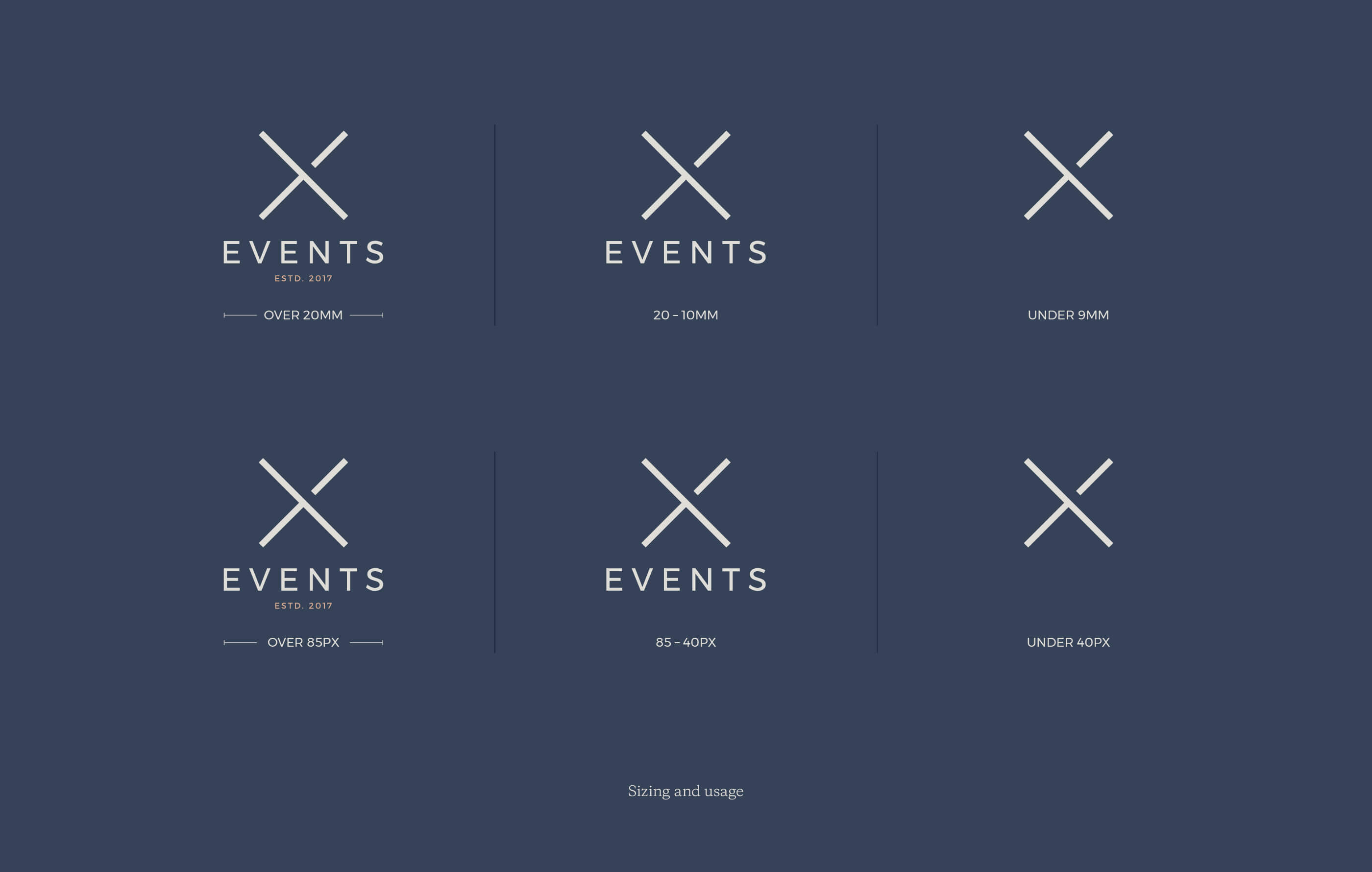
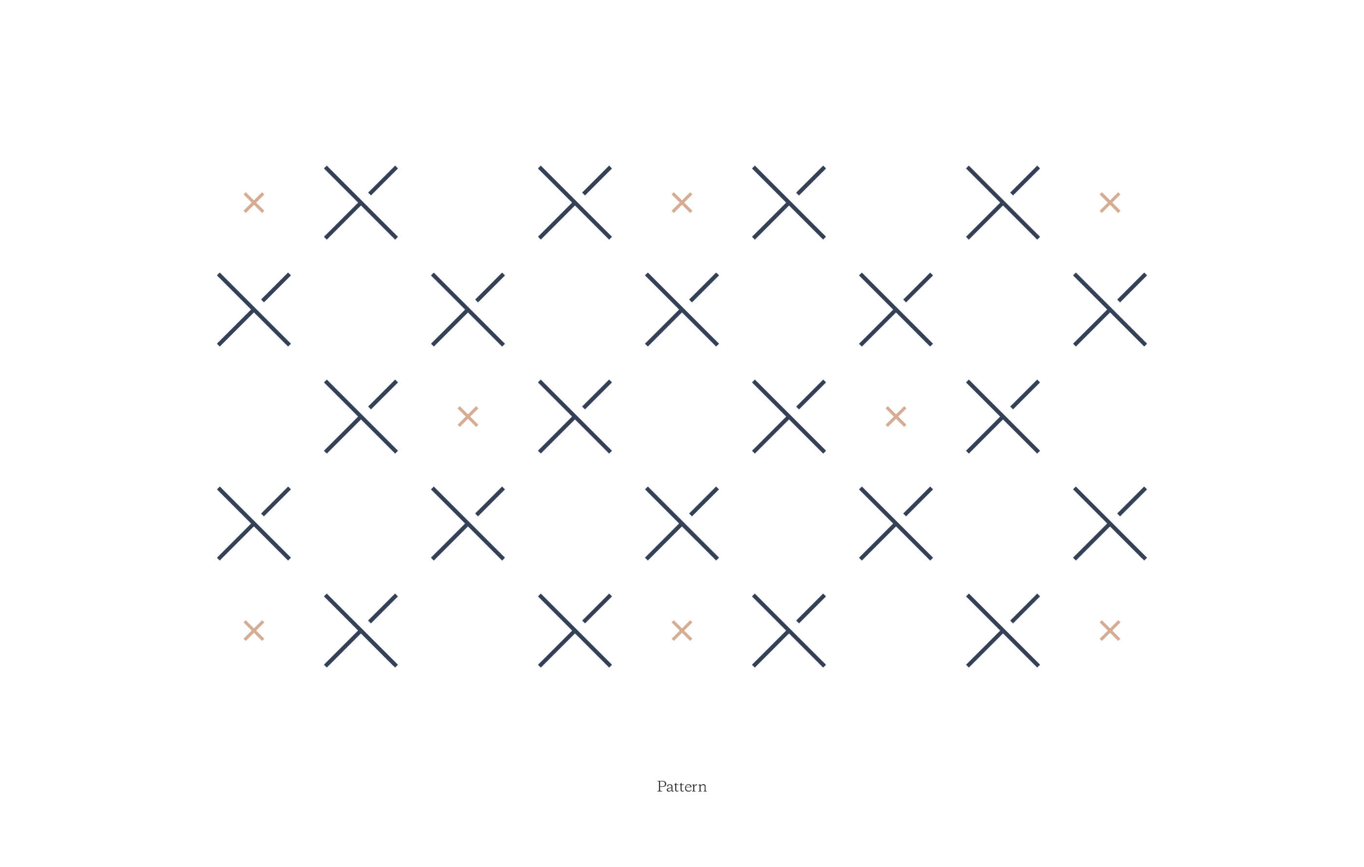
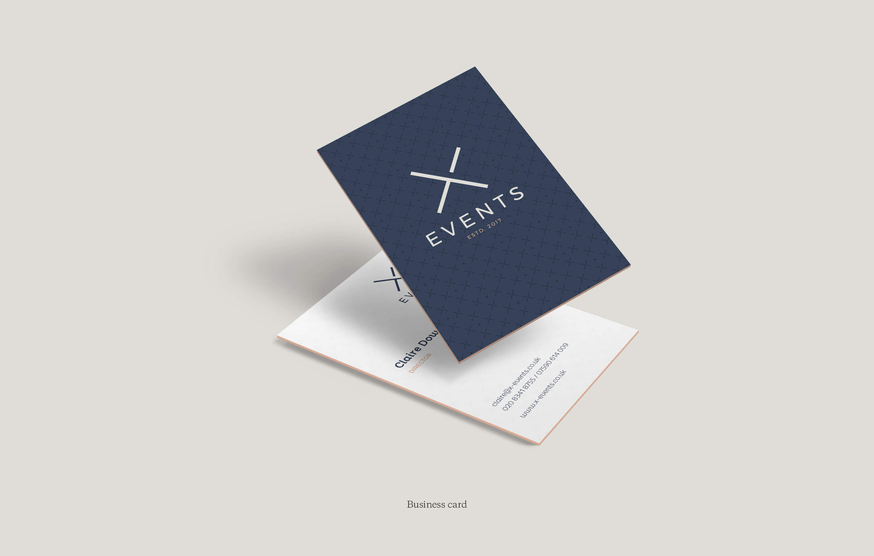
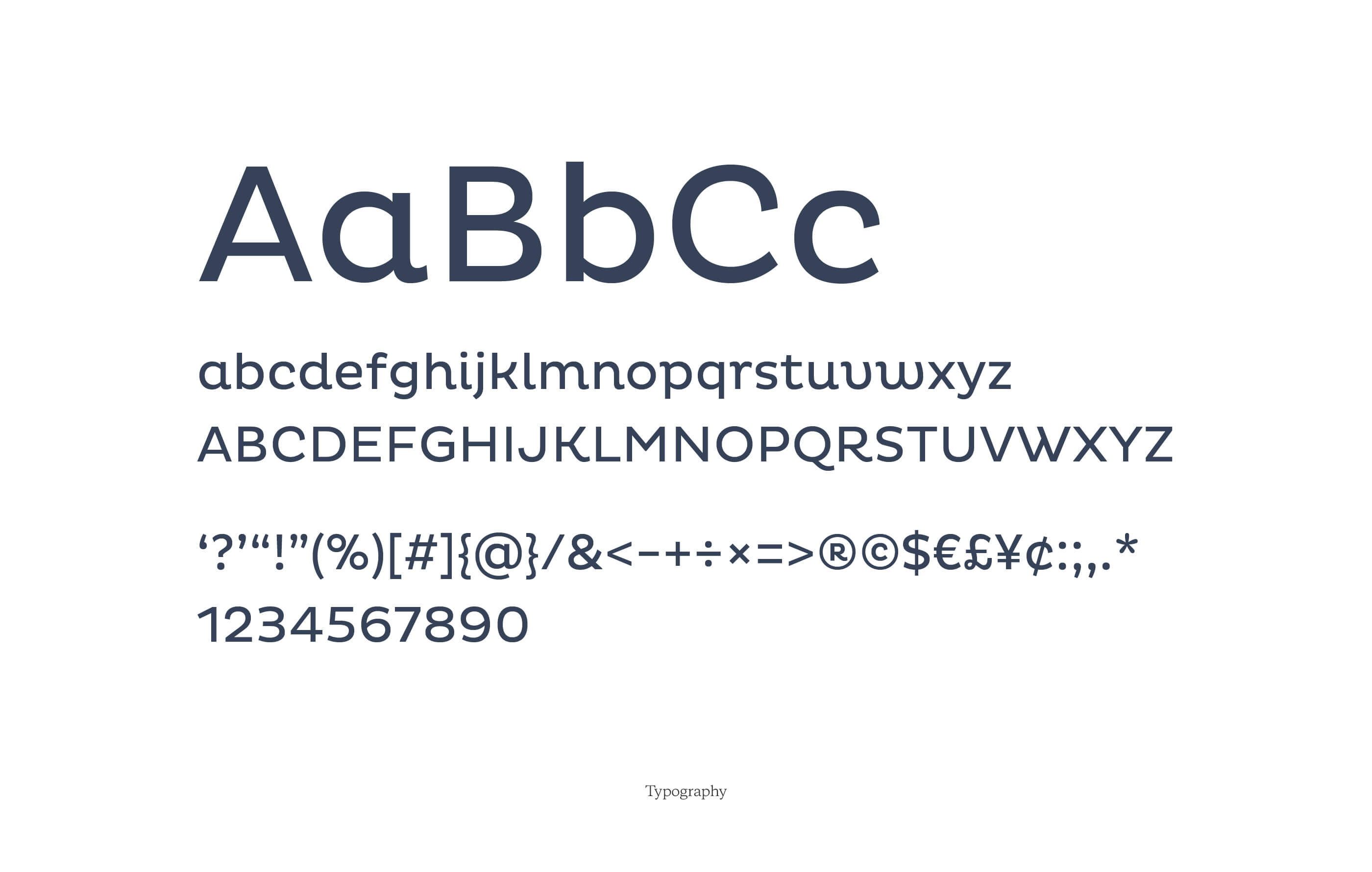
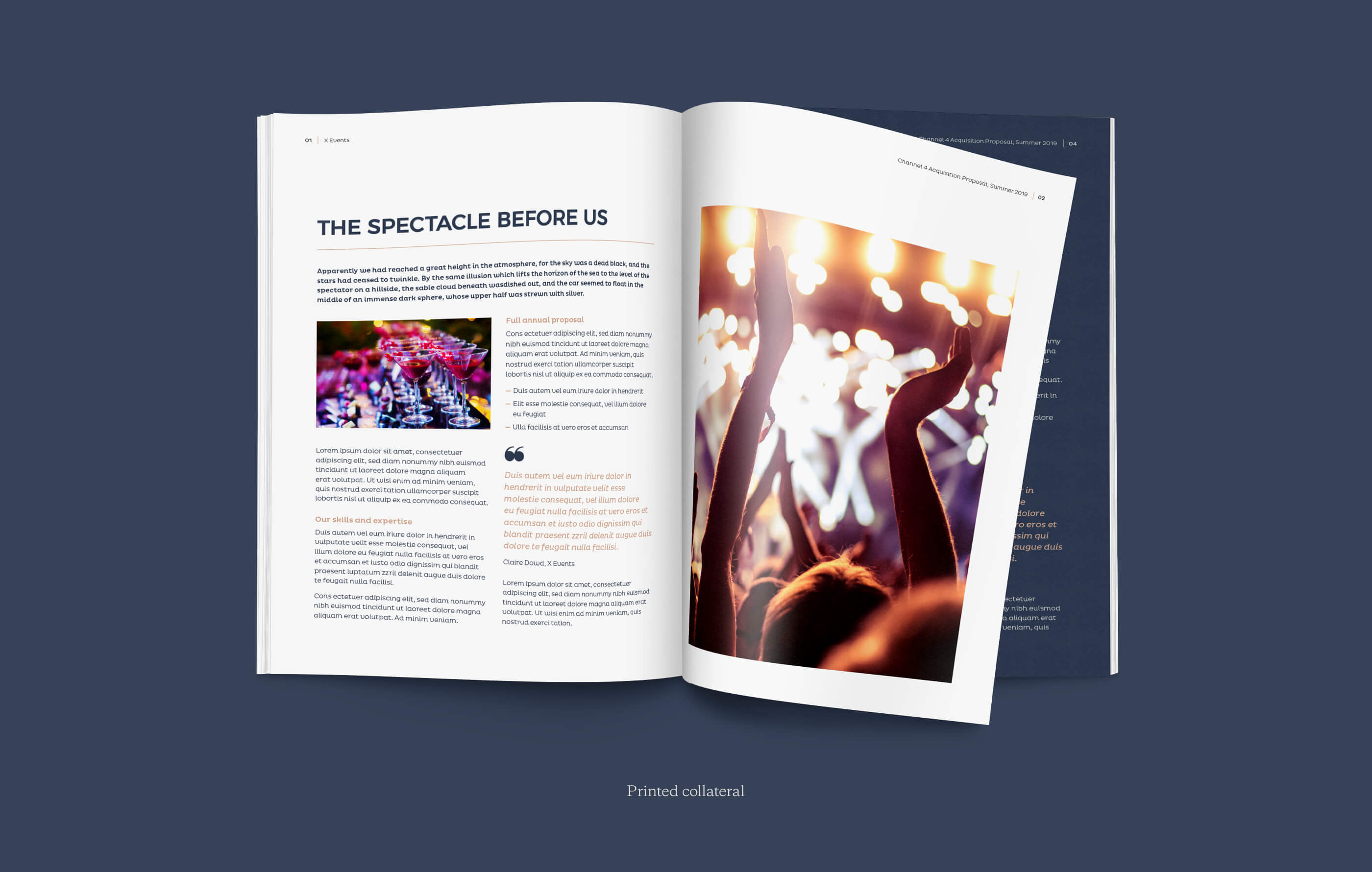
After creating the logo and logomark we set about building a core visual toolkit, built around personable and approachable typography, colour usage and pairings, subtle graphic elements and aspirational imagery.
-
Services
Logo & identity design
Brand development & architecture
Style guidelines -
Client
X Events